An inconsistent interface without a shared design foundation.
PlanSource lacked a formal design system, resulting in an inconsistent visual experience across the application.
Although a few custom colors had been established, much of the interface relied on browser defaults for typography, spacing, and other visual elements. Button styles also lacked a clear hierarchy, with too many primary actions competing for the user's attention.
The challenge was to establish a consistent visual language that would improve usability, create clearer hierarchy, and provide a foundation for future application development.
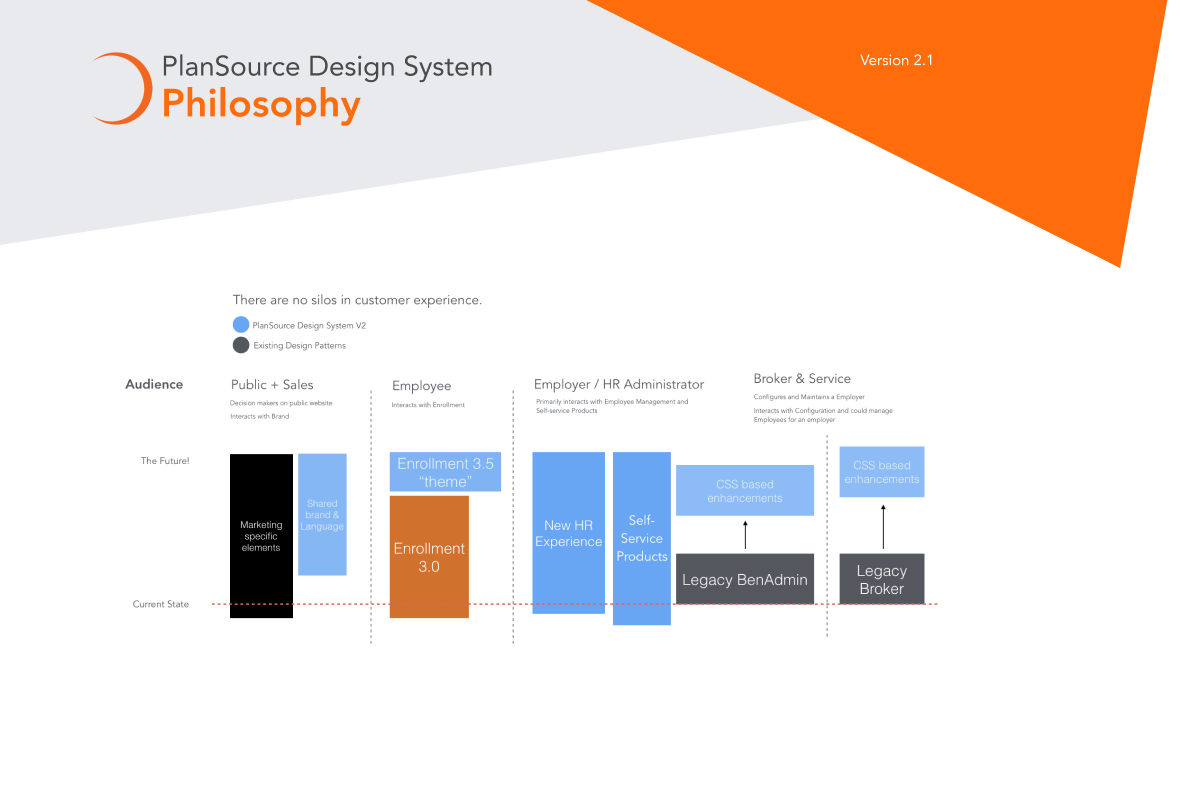
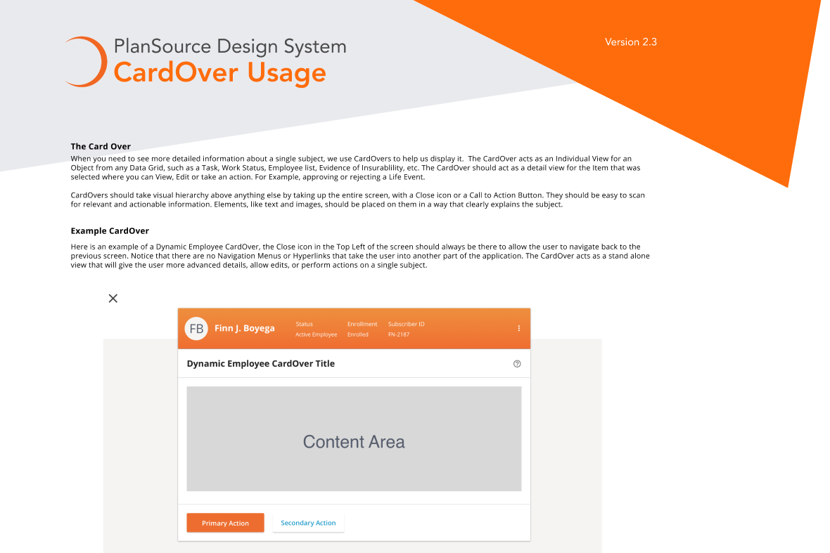
Use Material Design as a foundation for consistency.
I used Google's Material Design guidelines as a starting point for establishing a more cohesive visual language and modernizing the application interface.
Rather than introducing isolated design changes, I focused on creating reusable visual foundations and consistent interaction patterns that could be applied throughout the platform.
This included defining typography, establishing button hierarchy, modernizing form elements, and introducing reusable components for managing information and navigating complex application workflows.
Establishing the visual foundation.
The first step was replacing inconsistent browser defaults with a more intentional set of design standards.
Key foundations included:
- Typography: Introduced Avenir for headings and Open Sans for body content to establish a consistent typographic hierarchy.
- Color: Established a more intentional color palette to replace reliance on browser defaults.
- Spacing: Introduced consistent spacing conventions to improve alignment, readability, and layout structure.
- Visual hierarchy: Established more predictable sizing, styling, and emphasis across interface elements.
Color
A focused palette establishes hierarchy while semantic colors communicate status alongside text and icons.
Typography
A clear type hierarchy separates page titles, section headings, body content, labels, and supporting information.
Spacing
A predictable scale makes layouts easier to compose and helps reduce one-off implementation decisions.
States
Interaction states are treated as part of the component rather than visual polish added at the end.
Reusable components for a more consistent interface.
With the visual foundations established, I introduced a collection of reusable UI components based on Material Design principles.
Key components included:
- Buttons: Primary, secondary, and tertiary button styles to establish a clear hierarchy of actions.
- Form Elements: Modernized input fields and form controls with consistent styling.
- Cards: Reusable content containers for organizing information and related actions.
- Table Controls: Consistent interface elements for interacting with and managing tabular data.
Buttons
Clear hierarchy and predictable states for common actions.
Forms
Consistent labels, controls, validation, and focus behavior.
Cards
Structured content containers with consistent hierarchy and spacing.
Navigation
Predictable navigation patterns make location and hierarchy clear.
Data displays
Tables and information-dense layouts use hierarchy to reduce cognitive load.
Feedback
Status, confirmation, loading, and error patterns communicate what happened next.
Creating consistent interaction patterns across the application.
Beyond individual components, I focused on how those elements worked together to support common application workflows.
The updated interface introduced several reusable interaction patterns:
- Table Filtering: Consistent filter controls to help users locate and organize information.
- Table Customization: Drawer-based interactions that allow users to customize table views and configurations.
- Multi-Level Navigation: Hierarchical dropdown navigation to organize application sections and provide access to deeper levels of content.
- Action Hierarchy: Consistent button usage to help users distinguish primary actions from secondary and supporting actions.
Complex forms
Break complicated workflows into smaller steps while maintaining context and clear progress.
Benefits comparison
Use consistent cards, tables, controls, and hierarchy to help users compare options.
Responsive behavior
Patterns adapt across screen sizes without making hover the only way to understand an interaction.
Accessible feedback
Use text, structure, focus, and appropriate status messaging instead of relying on color or animation alone.
Creating a shared visual language for design and development.
A consistent design system provides a common reference for how interface elements should look, behave, and work together.
By establishing standardized typography, button styles, form controls, and interaction patterns, the system created a more consistent foundation for implementing and maintaining the application interface.
It also provided a clearer framework for making future design decisions without introducing unnecessary variations across the platform.
Primary button
A more modern and consistent SaaS experience.
The updated design system established a cohesive visual language and introduced reusable components and interaction patterns across the PlanSource application.
Replacing inconsistent browser defaults with intentional typography, spacing, button hierarchy, and modern interface elements created a more polished and predictable user experience.
The result was a stronger UI foundation that could support additional application features while maintaining greater visual and functional consistency.
Consistency is the foundation of a better user experience.
A design system is more than a collection of colors, fonts, and reusable components. It establishes the visual language and interaction patterns that bring an application together.
By using Material Design as a starting point and introducing consistent UI standards, I helped transform an inconsistent interface into a more cohesive and scalable SaaS experience.